I have always been intrigued by games with focus on mood and atmosphere, like Journey (by Thatgamecompany) and Limbo (by Playdead). I knew that I wanted to work on games like these when I grow up. But since I’ll probably never grow up, I gave it a chance to do it right now, for the last year of my study program.
Inspiration
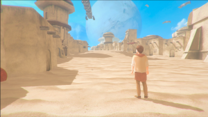 The whole idea behind When We Were One came into existence after seeing the movie Gravity in the local cinema. I was intrigued by the way the movie uses both visuals and audio to show big contrasts in mood and atmosphere. Since the movie is set in space, there are moments where you hear (almost) no sounds at all. The protagonist can enter an exploding space station in the next scene, resulting in an ocean of bombastic sounds. This way, audio really helps to complement the contrast between very wide and open spaces (alone, hovering in space) and very narrow claustrophobic spaces (alone in the broken space station). After seeing the movie, I knew I wanted to make a game based on multiple storylines (what they call a “mosaic story” in film making terms) where each storyline is a contrast in atmosphere compared to the other. The individual storylines are intertwined somehow and together, they should tell a bigger story. Kind of like the movies Babel and Cloud Atlas do, for example.
I knew I couldn’t make a game like this on my own, so I searched for a team mate who was good in creating audio to complement my visuals to make a visualization of the whole idea. I worked together with Max Klostermann on Construction Site Chaos before, and I knew he could be the guy. He’s awfully good in creating audio and 3D modelling as well. He happened to also have watched Gravity the other day in another cinema, and he was just as intrigued by it as I was. When I told him about the game idea, he was in and we even discussed the possibilities to form our own game company to graduate in (which was later dropped, since we couldn’t find a decent programmer).
Story and visualization
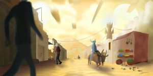
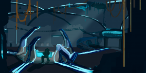
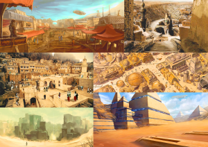
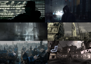
We started brainstorming on the themes for our mosaic story. After spending some afternoons on school filling in Excel sheets with random words and trying to mix them together, we came up with a quite some unique ideas. The ones that we ended up with were about a crowded Desert City and an abandoned Dark Age. One was cheerful, the other depressing. One was modern, the other run-down. We could see the contrasts working between the two and we made a 20-page document, describing the backstories of the environments and its characters, and how all of it is connected. We even had more little storylines that we wanted to fit in at first, but we decided to go for just two. We could always expand our story later, if we had more folks who could work on the project. But for now we were just with the two of us and we kind of liked the back story that we wrote.
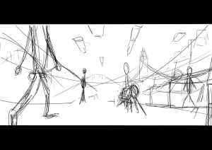
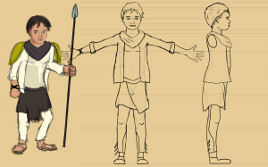
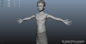
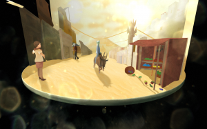
The next step was to make a visualization out of the story, to find the right mood that we were looking for. Max started working on audio moodboards, while I was working on visual moodboards and concept art. From there on, we were struggling on how we could make the visualization come alive. A teacher advised us to go for an interactive diorama, like a turntable, to show the styleframe of our story in 3D. What he didn’t know was that we actually had two stories that tell one bigger one. We played around with the idea to make a turntable that shows the styleframe of the Desert City on one side, and the one of the Dark Ages on the other. I ended up cutting the concept art of the Desert City up into chunks, so I could manipulate the individual parts in 3D space. This way, you could look around in the concept art. I also made sketches for the protagonist of this storyline, made a character sheet, and studied organic 3D modelling to make an actual 3D model out of this guy and put him in the diorama. In the meantime, Max was working on the Dark Ages side of the diorama, mainly by using 3D props. For the main character in that story we didn’t have a final design yet, so I ended up acting for a green screen and we used my silhouette in the diorama. Finally, we put everything together in Maya and Unity yo create the interactive visualization.
We wanted to use the diorama to pitch our game idea, or game mood to be more precise, to other students. But since we were also busy with our free minor in the mean time (studying storytelling, game design, concept art, 3D modelling and animation) it took us more time to finish the diorama than we originally intended. So when we came at the point of our minor where we actually were going to make a prototype for our game, we just finished the diorama, but we didn’t have a bigger team yet. So we started working on the prototype with just the two of us.
From prototype to production
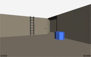
Both Max and I aren’t hardcorde programmers. I know the basics of C# and JavaScript, but we realized that that’s not enough to make a whole game. We stumbled upon some great assets from the Unity Store that could help us speeding things up a little bit, since I could start with altering existing code from these assets to make it work for our game. We knew from the start on that our game would have elements from traditional adventure games, so we looked for assets that could help us implementing these elements. The most valuable assets we’ve used are Adventure Creator, which is a node-based framework for creating classical adventure games and Ultimate FPS, which, as the name implies, is an asset for making first person shooters. I started playing around with these tools to make them work for our game idea. The first thing that I did, was getting rid of all the guns from Ultimate FPS, so I ended up with a realistic first person controller that can crouch, jump, climb ladders, etc. (much more realistic looking than the native FPS controller that’s included in Unity). What followed afterwards was a process of going back and forth with playing around with the Adventure Creator features and designing new features that we wanted for our game. In the end, I made a very simple prototype consisting of blocks and spheres, which displays all the functionality that we wanted to have in our first level, along with some silly ideas that we ended up not using. (Like floating guns shooting at you. Yuck! This was merely to test the respawning).
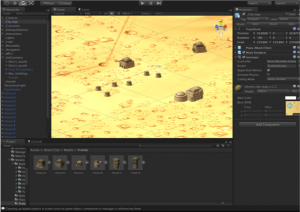
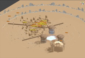
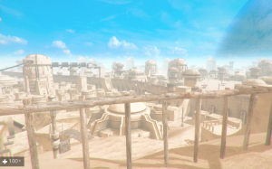
While I was working on the prototype, Max was modeling the buildings for our city. When we saw each others work, we knew we wanted to bring it together in an actual playable level of the Desert City, with the mood and atmosphere that we researched during the visualization phase. So I opened up the 20-page backstory file again and from there, started working on the actual story that the player experiences. In there I used the theories that I learned during the game design and storytelling study that I did for the first part of my minor. While working on the story, I also started working on another prototype, which contained Max’ models. We had a map of the city which we designed with the backstory in mind, but when I was placing buildings exactly on top of the map (see image above) the city became way too big. According the the story, the city should have quite some alleyways for the player to walk through, but since all the houses were so far apart, it didn’t even feel like the city had alleyways. So I started from scratch and put the buildings close to each other in Unity. The player shoulnd’t get bored by just walking through them if there are no specific events happening, so I measured how many house models an alleyway could have before it felt “too long” for the player. From there on, I started building the city (while listening to this music). An important thing to keep in mind when building the city was the verticality. I wanted to have a lot of hills with buildings on top, so no matter where the player was standing, he should feel surrounded by houses. In the end, this lead to the idea to make a sight-seeing point on a hill. From here on, the player should be able to oversee a big part of the city, and he could see the path that he already took from here (which is always good, game design-wise).
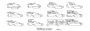
Once I had the basic city done, it was time for playtesting. From a very early point in production we did playtests to see if players liked to walk a certain distance, even without having actual goals. Of course, we kept playtesting the level once the goals and NPCs were in there, but it was important for us to see if people liked what we were doing with the level. This resulted in iterating the level a billion times. While I was doing that, Max was modeling props for the city to make everything seem more crowded, and doing some color correction to get the mood that fits the original concept art. At this point, I was also making new concept art myself to visualize props that weren’t in the game yet. For example, I made mock-up screenshots of how the crater in the end of the level should look like (see below, mock-up is on the left) and I designed the hovercars that you see in the game (see above). When the deadline of our minor approached, we were both trying to get as much as detail in the game as possible. That’s why I also ended up modelling and animating in the end. For example, the hovercar models and the walking robot are my works.
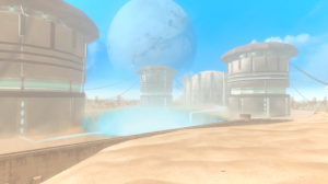
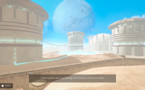
When we reached the deadline, the level was ready for the presentation. We recorded the entire minor presentation, which can be viewed using the link below.
We are still working on the level right now. The presentation is done, but we didn’t really optimize the game enough and there are way more character models and side-quests we wanted to put in there. The optimization is something that we are still working on right now. Once we think it’s stable enough, I will upload a playable build to the When We Were One page. So stay tuned for that!

