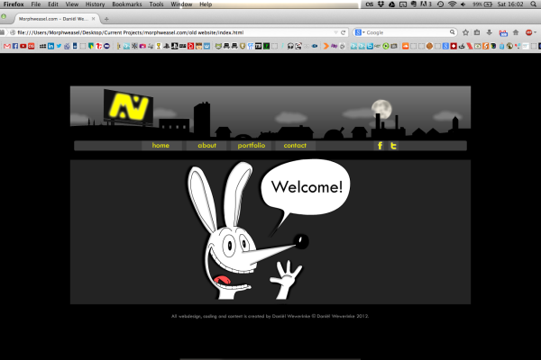
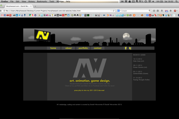
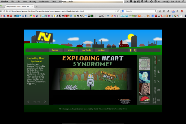
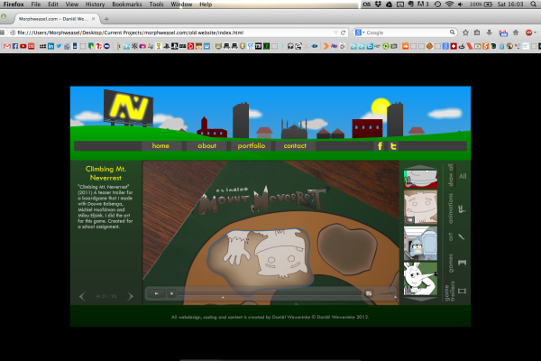
That’s right, my original website created in Adobe Flash is no more. It was time to update to something responsive, with an easy CMS and fashionably good looks that really complement my game design and art skills. So here it is: Morphweasel.com 2.0! So let’s look at what’s new.
- A lot of new portfolio items!
I haven’t updated my old website in a while, so a lot of new work was created in the mean time. Everything important is online now and as you can see I really focus on (visual) game design now. I’m pretty sure that will be my future profession and my website should show that I’m capable of doing that. Right now I’m looking for a company to do my graduation phase in, so having an up-to date overview of my skills was really important to have for me. - Download my games!
I tried to include a video and/or download to all of my portfolio items. Most of the games that I worked on are either playable in the browser or are downloadable for Mac and Windows operating systems. Look for download links on the top right side of portfolio items. (We’re still optimizing When We Were One for a stable web release. A download and video for that game will come soon!) - More frequent updates!
I’ve got a CMS running in the background that allows me to easily add new stuff to the site. So I will do just that more often than with my old website. If you’re interested in what’s to come, follow me on your favorite social media (see the contact page) and you’ll stay up-to date of updates on this website. - A blog!
That’s the thing you’re reading right now! I will post my art practices and updates on new projects here. I used to post these kinds of things all over the place on social media, but having them all in one place sounded like a good idea to me. The first update that you can expect will be about the development process of When We Were One. That will come really soon, promise. - Fancy HTML5 features!
Lots of subtile animations and full-screen images that really sell my work. Hopefully. At least I think this website’s theme complements my work and style and hopefully others like it as well. Also, it should now work on mobile devices, since every page is responsive.
So what about the orignial website and it’s custom made animations? Well, that’s gone. I was kinda proud of it at the time, since I made the whole thing from scratch. But it was just crashing too often and couldn’t really display images in full res, which really is a waste for a portfolio website. So let’s look one more time at the images of the old site below and then move on. Happy Morphweasel.com 2.0 launch day 😀


